Magazine face-lift

Magazine design these days is pants. I’m talking about your everyday high street publications here, bought by Joe Public. I long for the minimal designs again, the quietly understated covers such as The Face that sat confidently on the shelves in the 80’s. Thoughtfully designed front covers seem to have been ditched in favour of glossy covers that double as contents pages, covered in bold type and exclamation marks.
Until now.
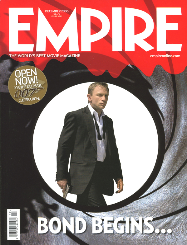
Empire, a popular film magazine, has recently undergone something of a face-lift, and the result is a publication that stands head and shoulders above anything else on the shelf. While others scream desperately, Empire smiles confidently. Next time you’re in WHSmith’s or Borders have a browse in the magazine section. Which covers stand out, and why? Bond is indeed back, and so at last is decent cover design.
Leave a Reply